The task of the NZ International Comedy Festival campaign has grown and matured over the past 25 years. There was a time when a few wacky posters and some zany fonts were enough to grab attention and get bums on seats for a couple of dozen shows. But now the Festival gets over 100 thousand attendees, top shelf international acts and has serious global prestige. The party hire graphic approach just won’t cut it in 2017, the audience has become sophisticated and discerning. An audience has a lot of options for their entertainment dollar, they could go to the theatre, a rock concert, an art gallery show or take up residence on their couch and watch cat videos.
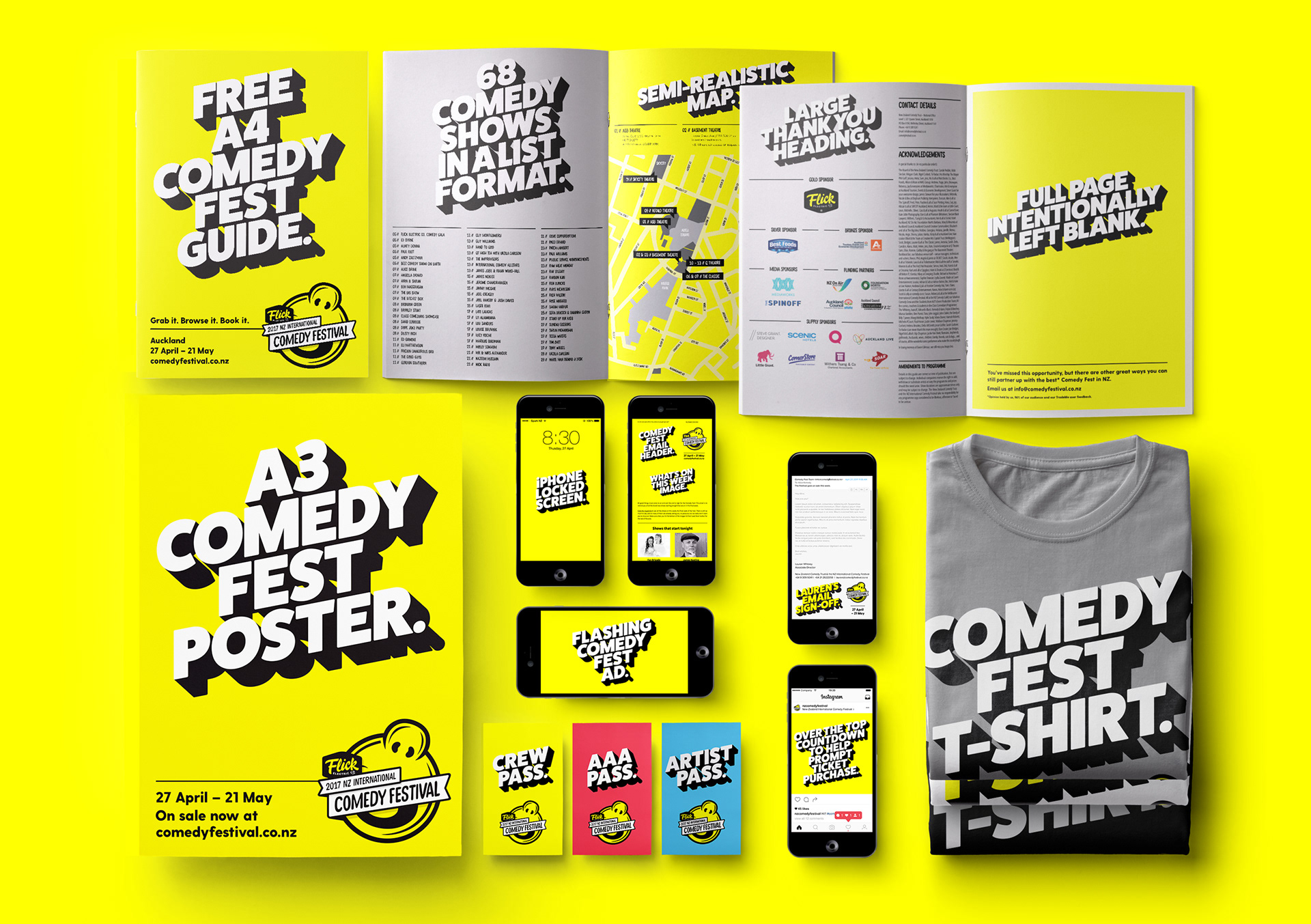
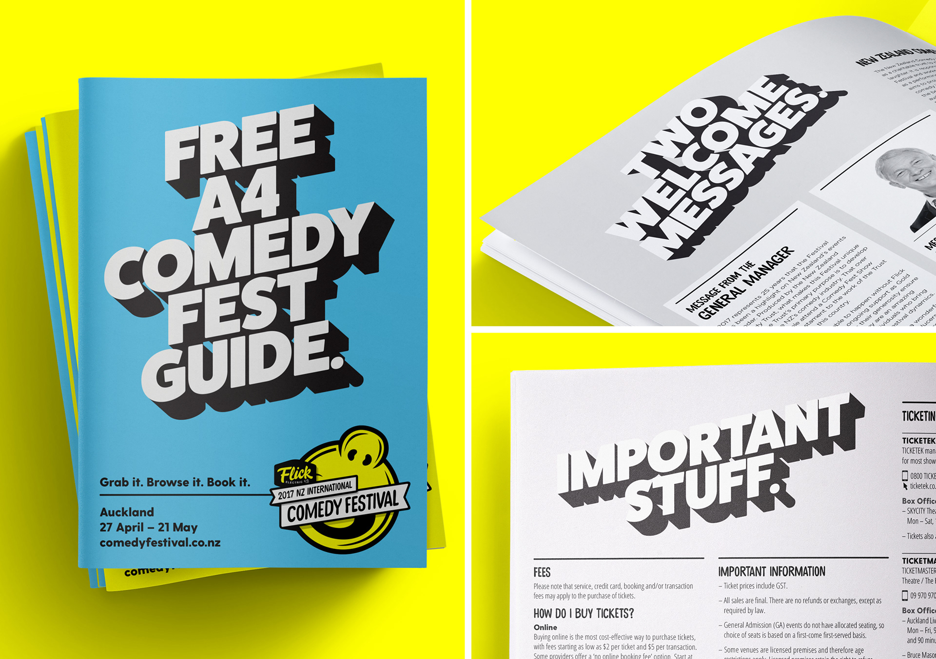
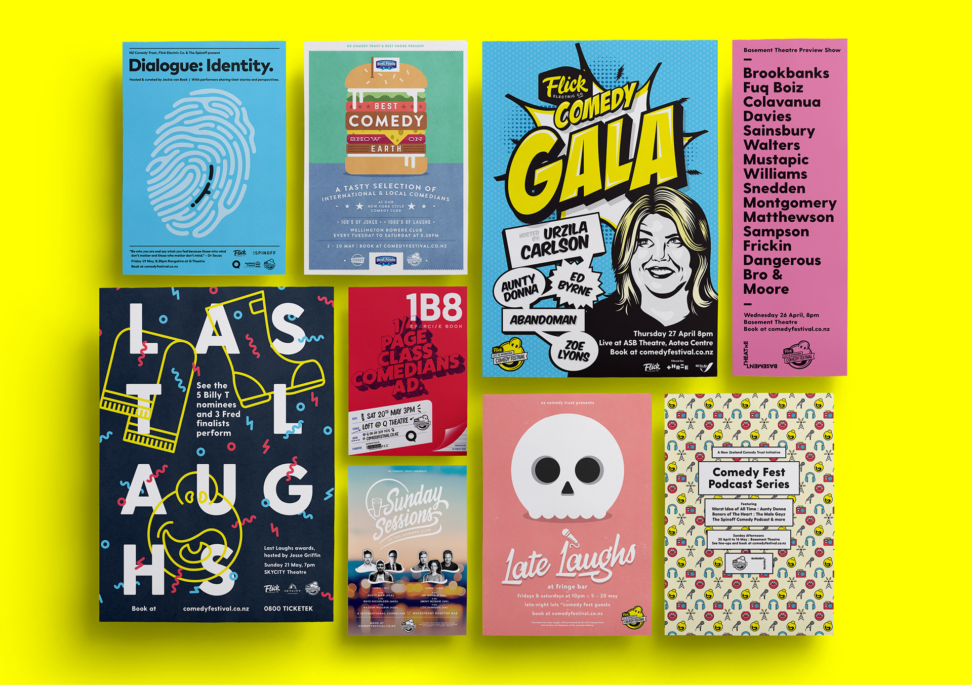
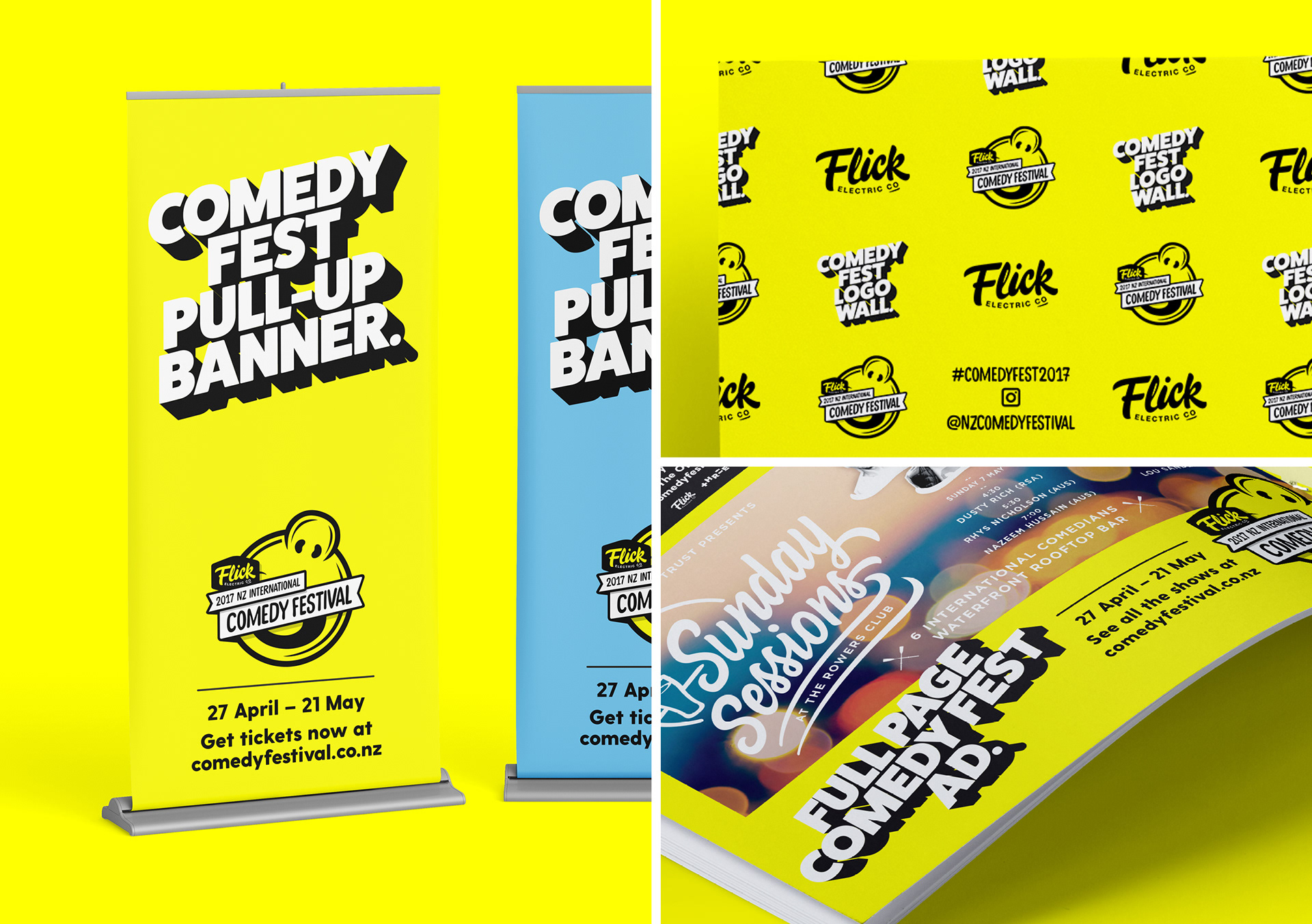
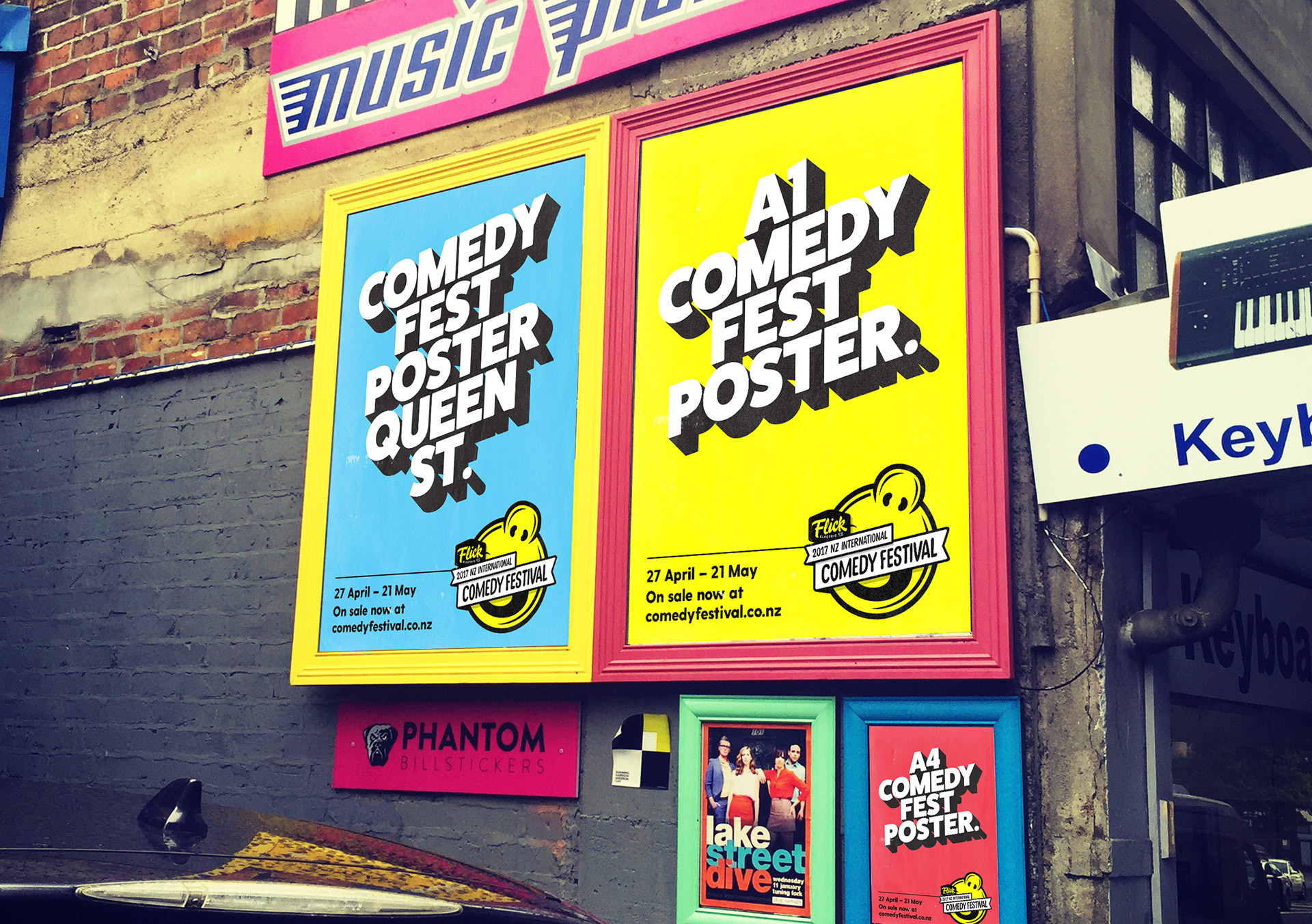
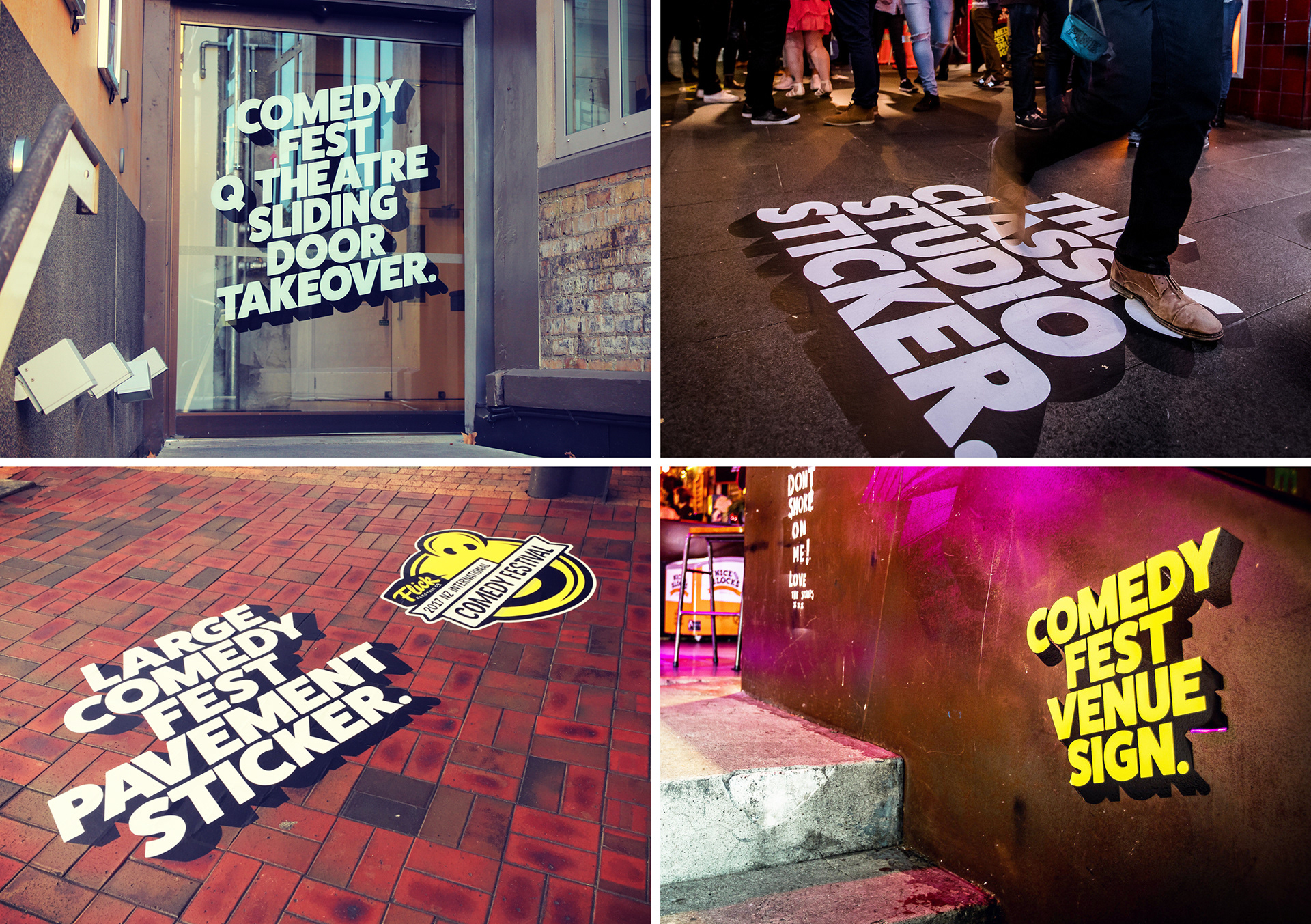
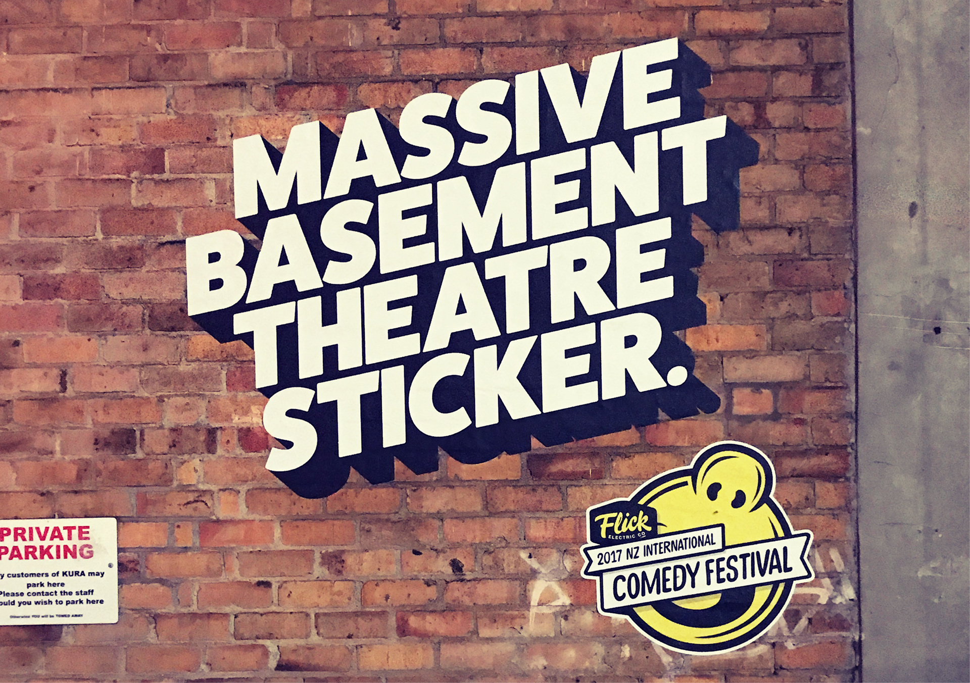
Our extensive cross-media campaign includes metrolites, posters, billboards, TVCs, web, street decals, and programmes for both Auckland and Wellington totalling over 100 pages of content. The primary awareness campaign creates an umbrella brand, but we also need to create looks for a dozen additional curated shows, as well as managing the communication for individual shows of over 150 comedians. It's a massive undertaking in information management of supplied content alone.
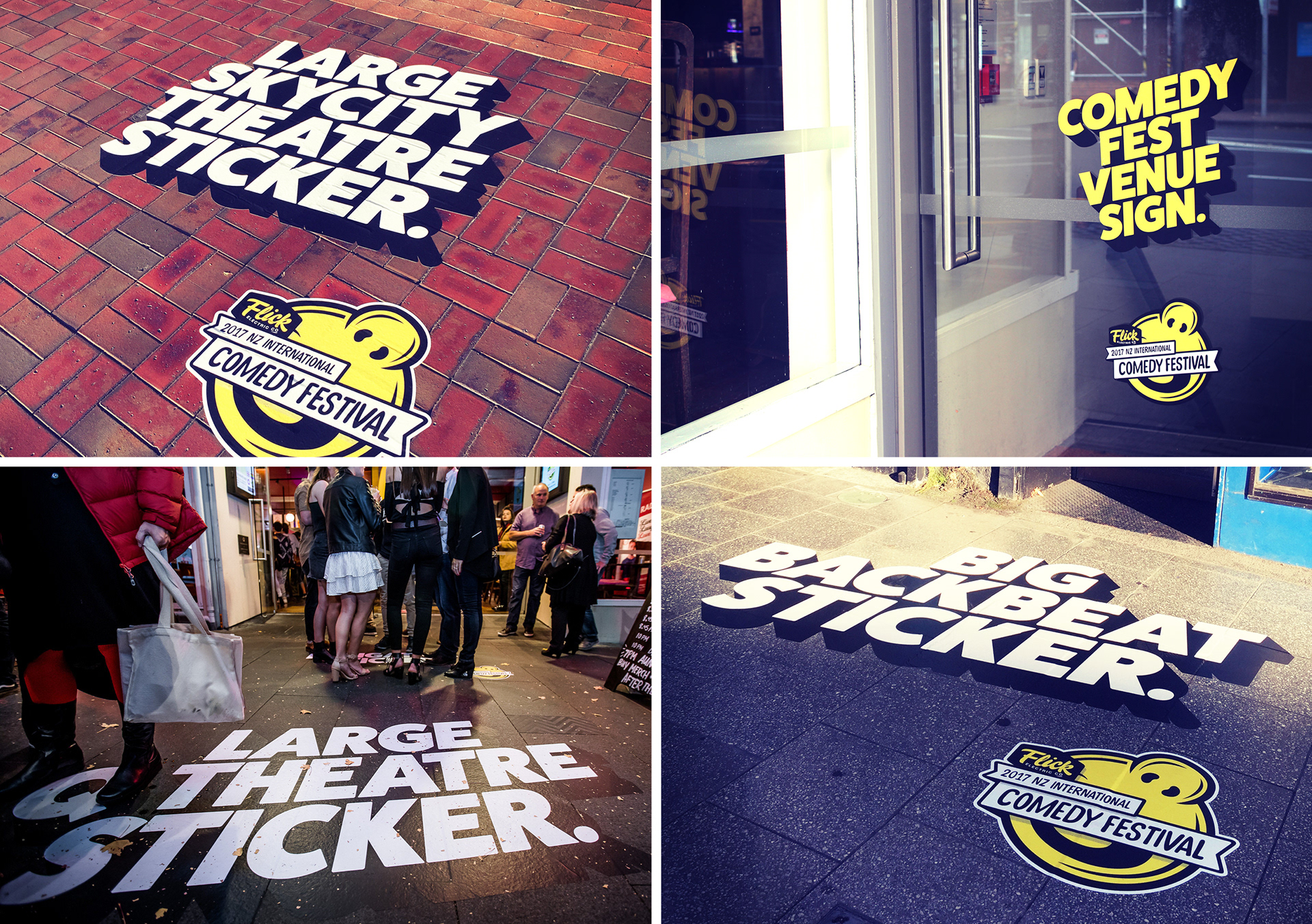
Brevity is the soul of wit according to Shakespeare, and so our challenge was to create an engaging awareness campaign that communicates graphic wit that people understand at a glance. Kiwi comedy is diverse, but still has it's own distinctive voice. As evidenced by the success of acts like Flight Of The Conchords and Rhys Darby, we do deadpan well. It often trades in the domain of radical honesty, stating the thing that’s right in front of you, and perhaps making you see it in a new light.
So we decided that’s exactly what we'd do, stating the obvious to the viewer, but delivering it with graphic urgency, forcing a juxtaposition between the dynamism of the delivery and the banality of the copy. It takes a poster and tells you it's a poster, it breaks the fourth wall you get taught so often as an artist not to break.
Artifice is stripped away in favour of comical, ridiculous deadpan humour, like only we kiwis can deliver. We play with the irony of a mundane message delivered with exuberance and urgency. It's silly and fun, but also slick and well crafted.
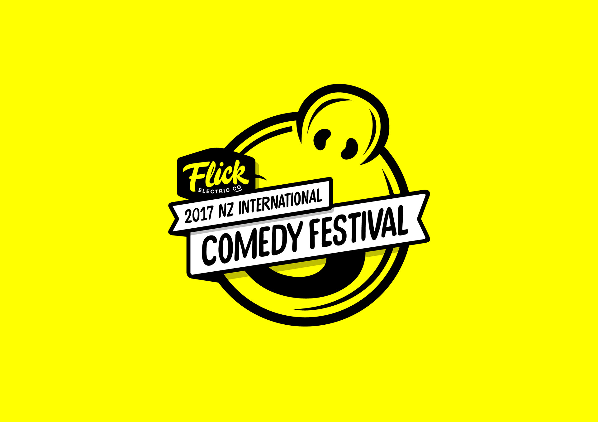
We stuck with strong simple colour values, using bold black, white and yellow, while the well established but newly refreshed 'laughman' logo provides recognition and brand continuity from previous campaigns. The visual tone evokes comedy, it jumps off the page/wall/screen with vibrancy and depth, loudly proclaiming comedy wherever it appears. Establishing this style allowed us to avoid rubber-stamping the words “Comedy Fest” on every piece. It let us be cheeky, witty, and serious when required, and tailor a unique message for every medium, across outdoor, digital and print, a perfect blend of variety and consistency.