In collaboration with
Designworks
Tip Top
Designworks
Tip Top
Services
Packaging
Communications
Packaging
Communications
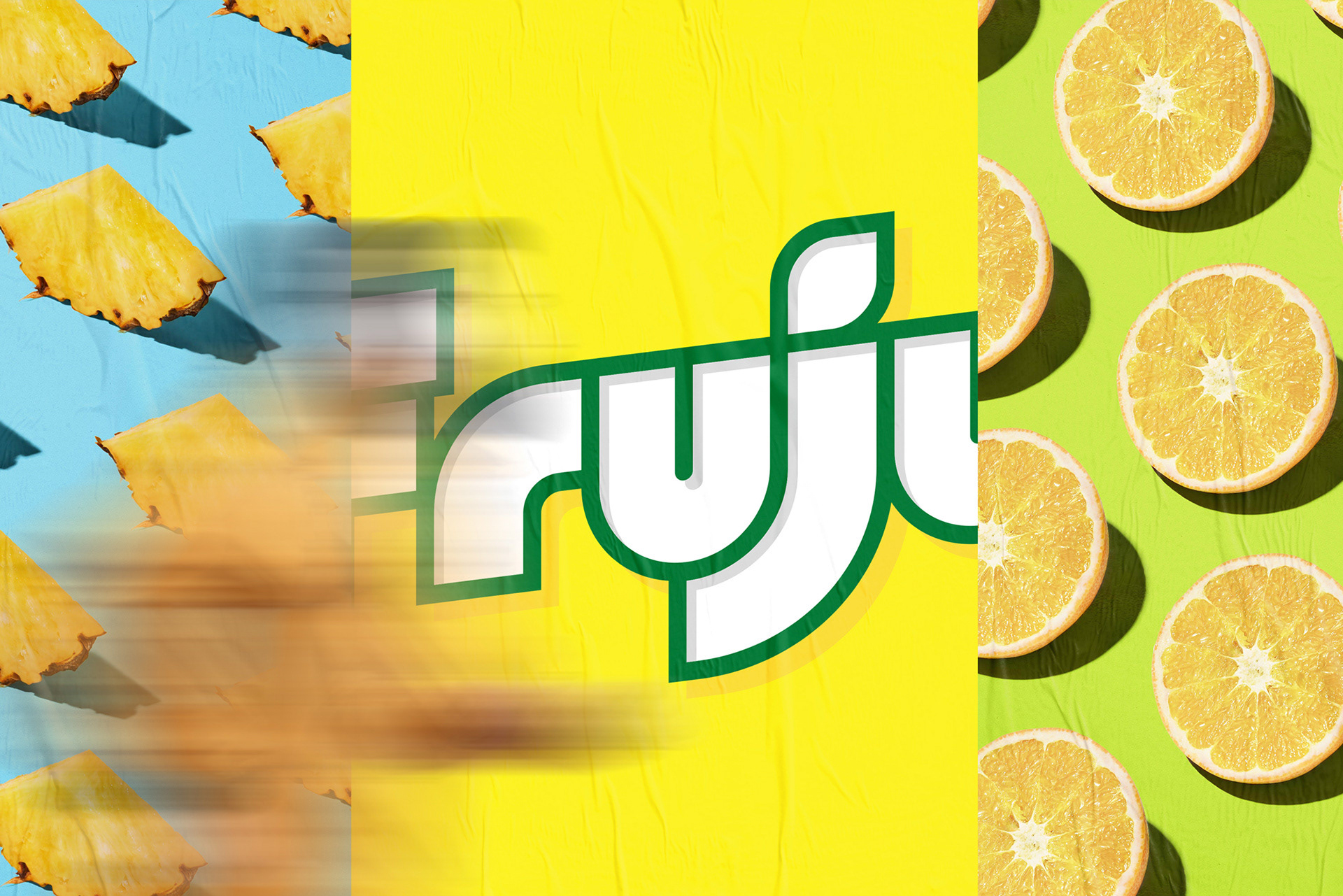
Since its launch in the early 1980’s, Fruju has been synonymous with summer refreshment. But it was beginning to lose its appeal and relevance – and we simply couldn’t bear to see that happen. It was time to give this refreshing fruit hit on a stick a bit of a refresh itself.


Inspired by the original visual cues, we’re bringing back the visual punch, starting with a bold and impactful wordmark that becomes a new yet familiar icon for this already iconic brand.

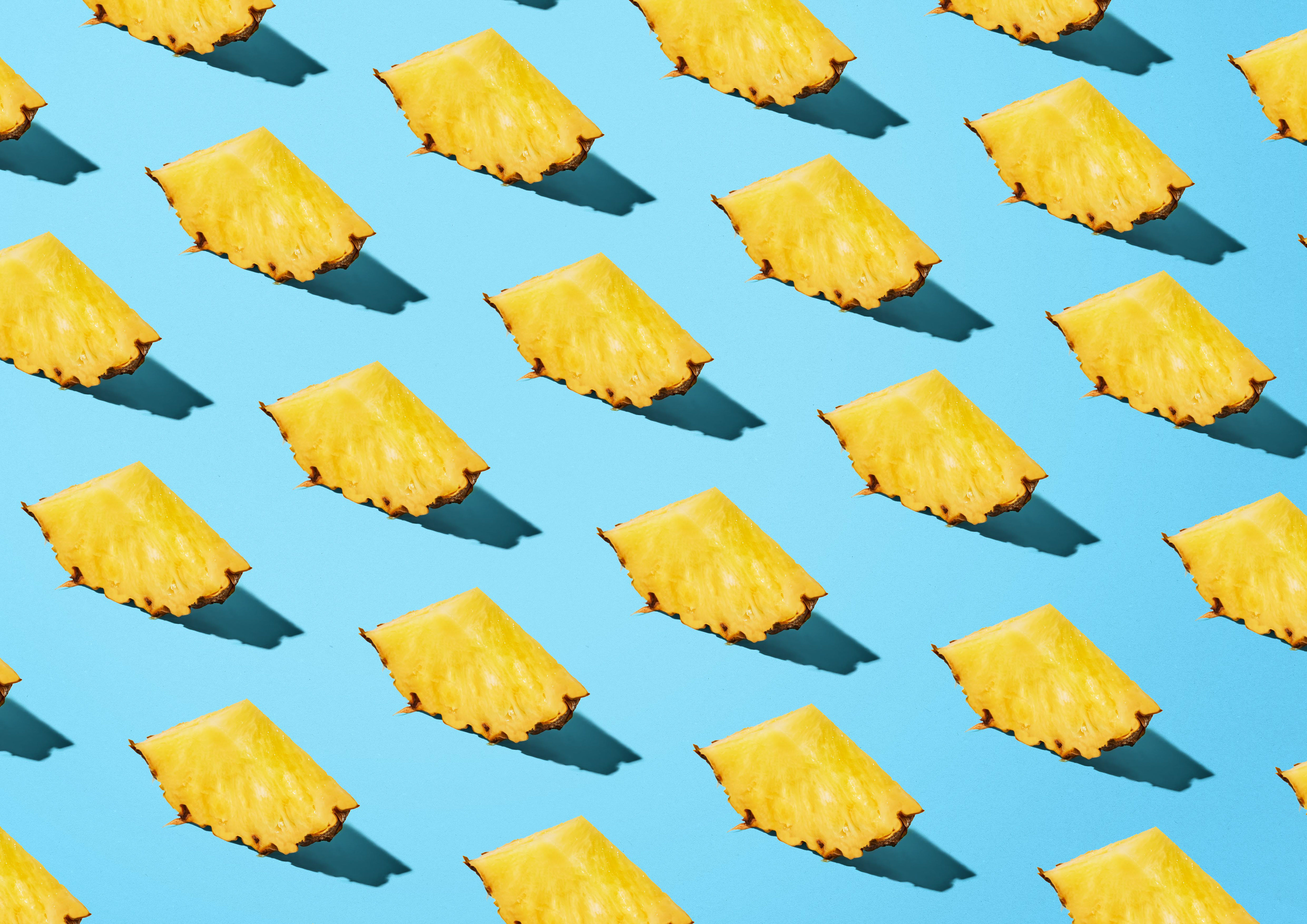


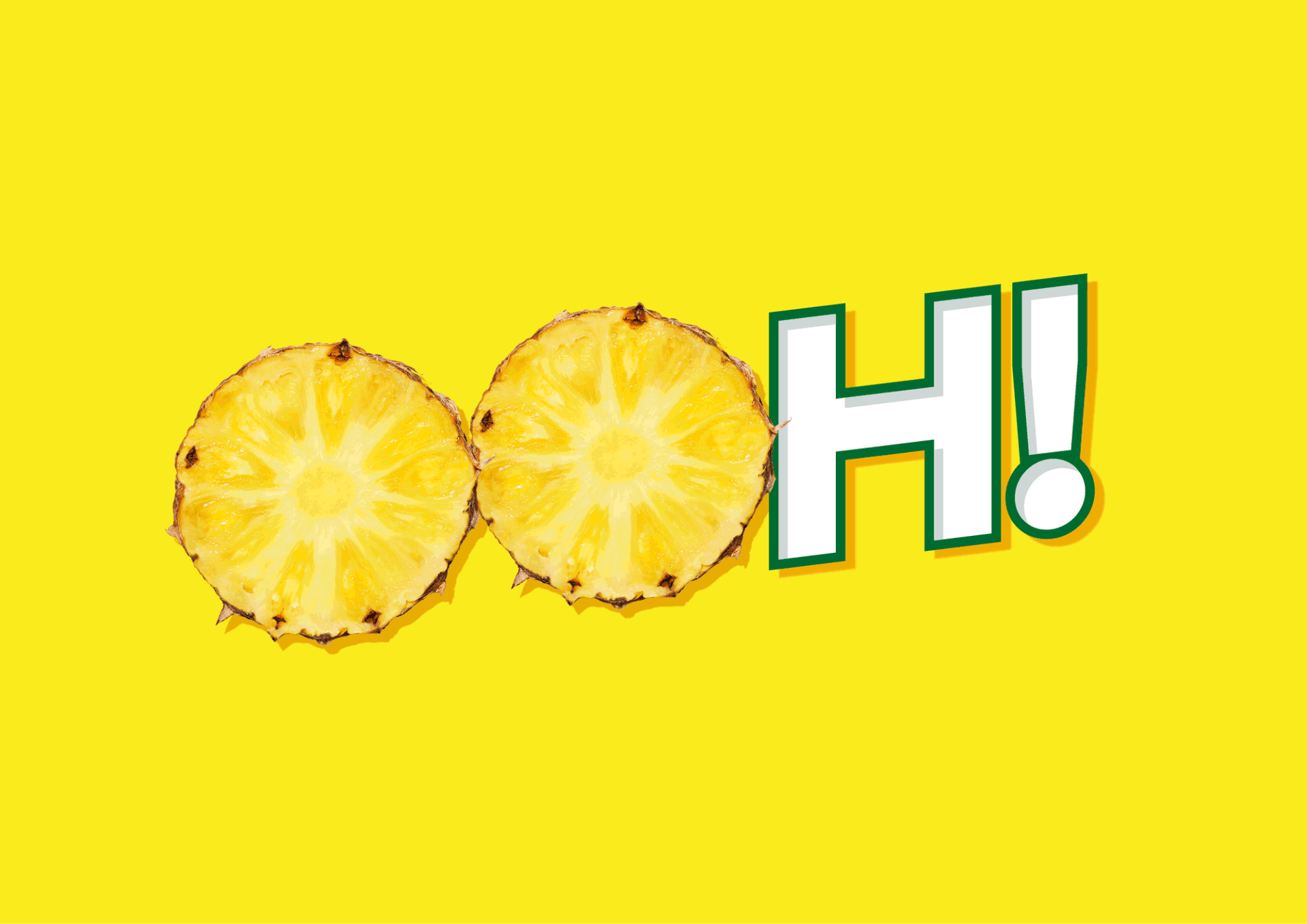
Vivid bright colours and extravagantly delicious fruits bring the full flavour and refreshment factor to the fore through packaging and other assets.
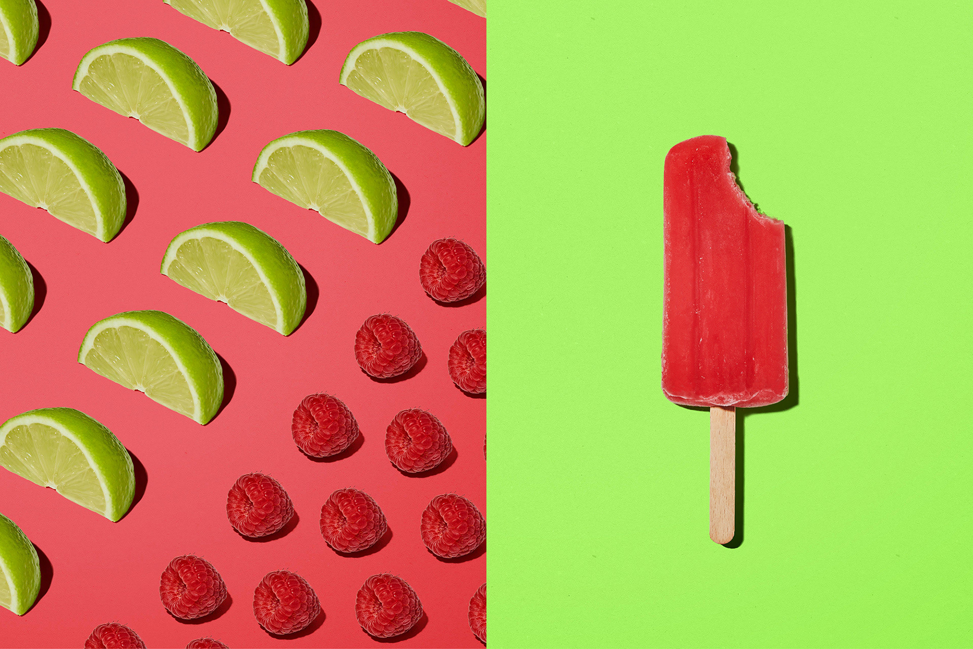
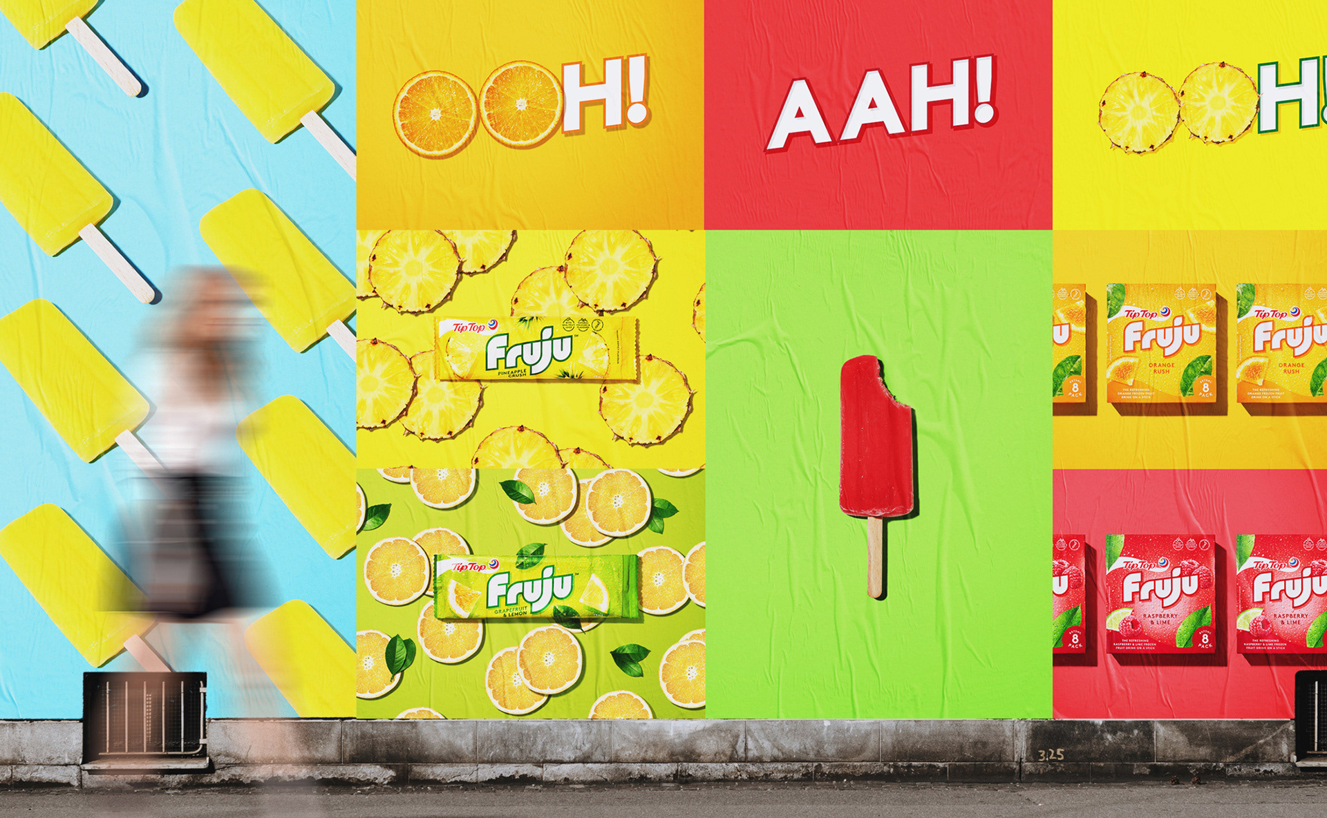
Photography captures the bright vibes and strong shadows of Kiwi summer, bringing the full refreshing flavour of Fruju to life.